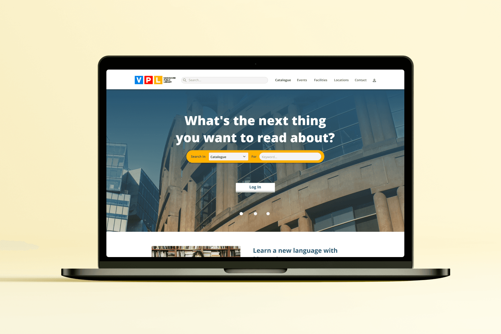
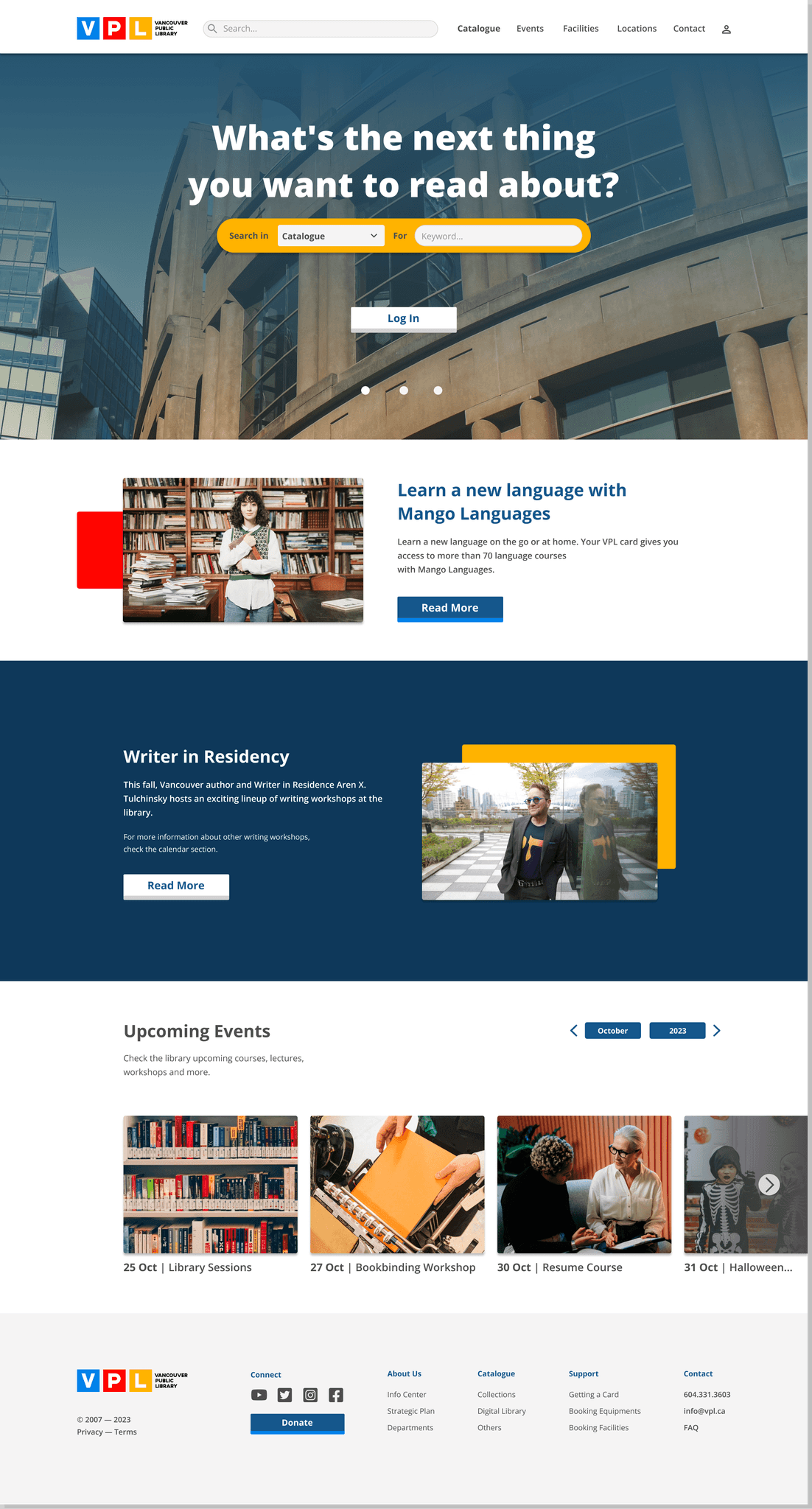
According to the Vancouver Public Library's 2020-2025 Strategic Plan, their priorities focus on the following pillars: learning and creativity, shared spaces and experiences, belonging and connection, and organizational strength. As a long-time fan and advocate for the VPL, I believe their website could be improved to facilitate access and enhance inclusion. Considering this context, this analysis and redesign aim to improve the website in ways that align with the library board's primary concerns, reflect my personal approach to classifying information (apologies to librarians if I’m tampering with something sacred), and is consistent with the design of their mobile app.
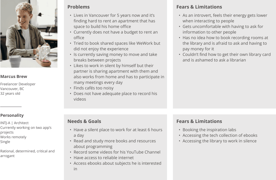
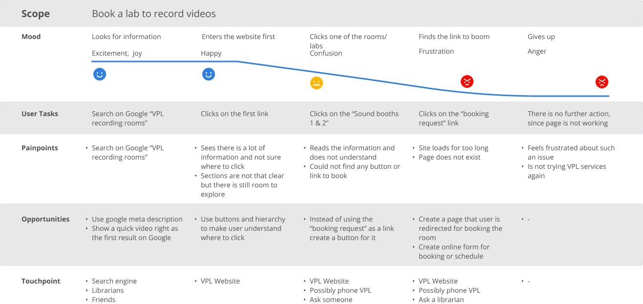
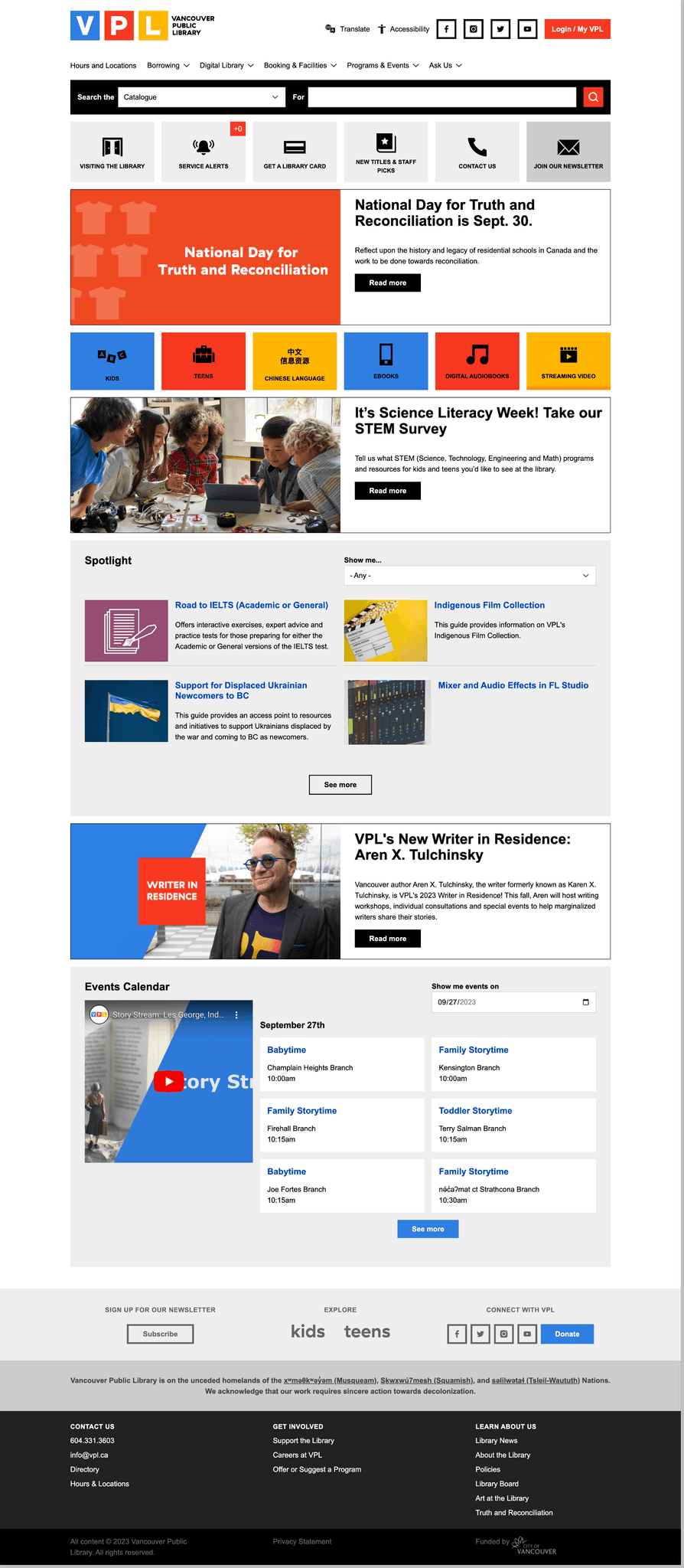
During the research process and while analyzing the skeleton plane, I found it challenging to understand the library's website information design and struggled with how the information was presented. As users, we can recognize a consistent style, but it feels overly constrained by a rectangular grid and an outdated website structure. Additionally, I don't find it effective in communicating all the resources the library has to offer. To better empathize with users, I created personas and journey maps to envision how the website should function. I also researched the websites of some of the world's most renowned and largest libraries, but to my disappointment, many of them share similar usability issues.
Both the library and its users would benefit from a review of its information design, specifically. I've lost count of how many times I’ve had to explain to my friends how I got the books I read and how they could access a library card. If so many people are asking and not understanding, it’s because the design isn’t clear enough. I understand that I may be biased as an immigrant, and most of my friends fall into the same category. Maybe this is something people are taught in school here in Vancouver. However, adding more contrast and hierarchy to the website would certainly benefit even those already familiar with the platform.
Image on hero section and platform screens from Unsplash
Image of user persona from Pexels
