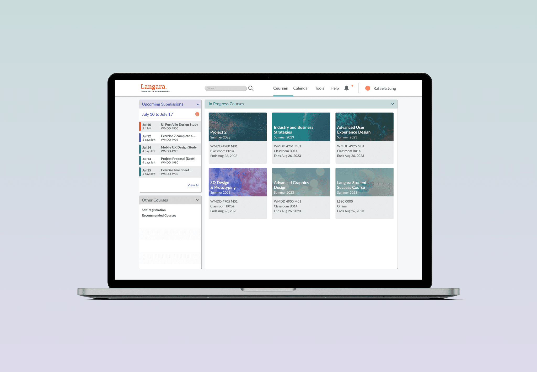
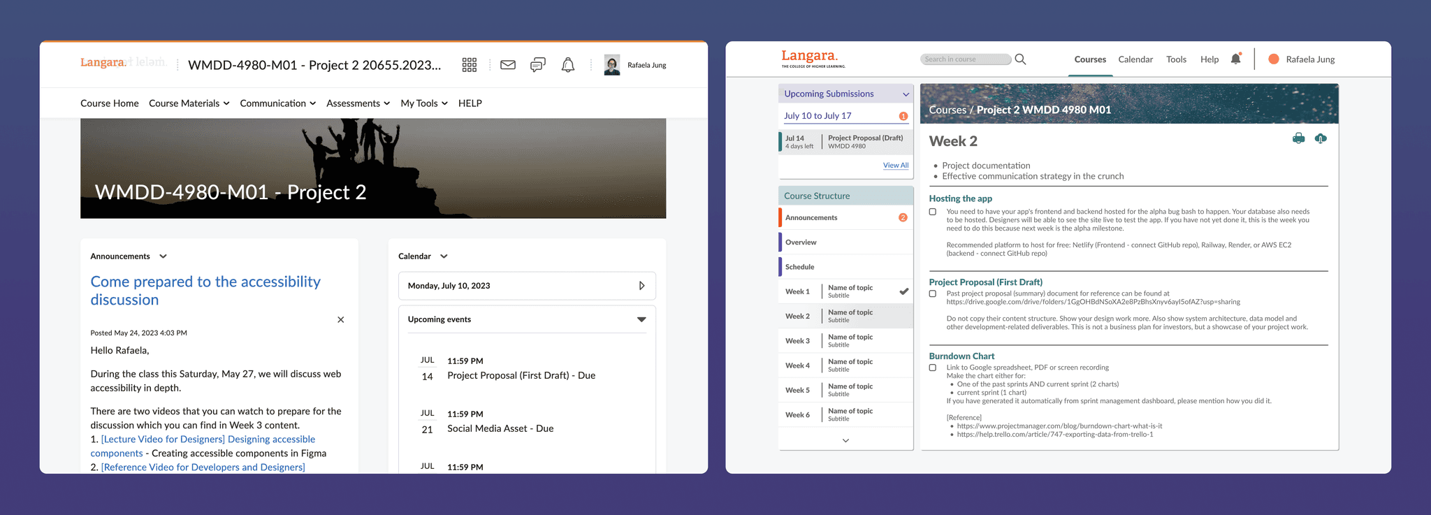
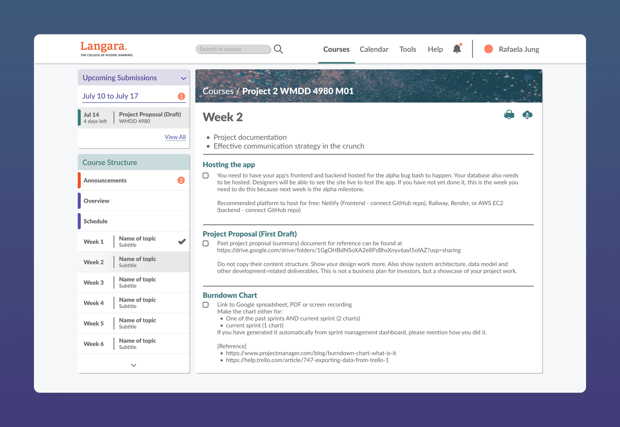
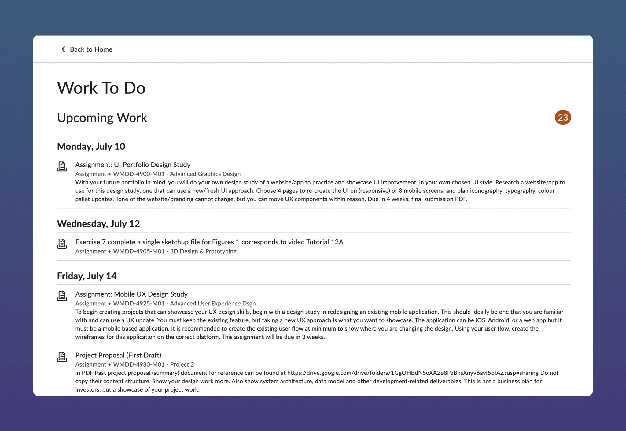
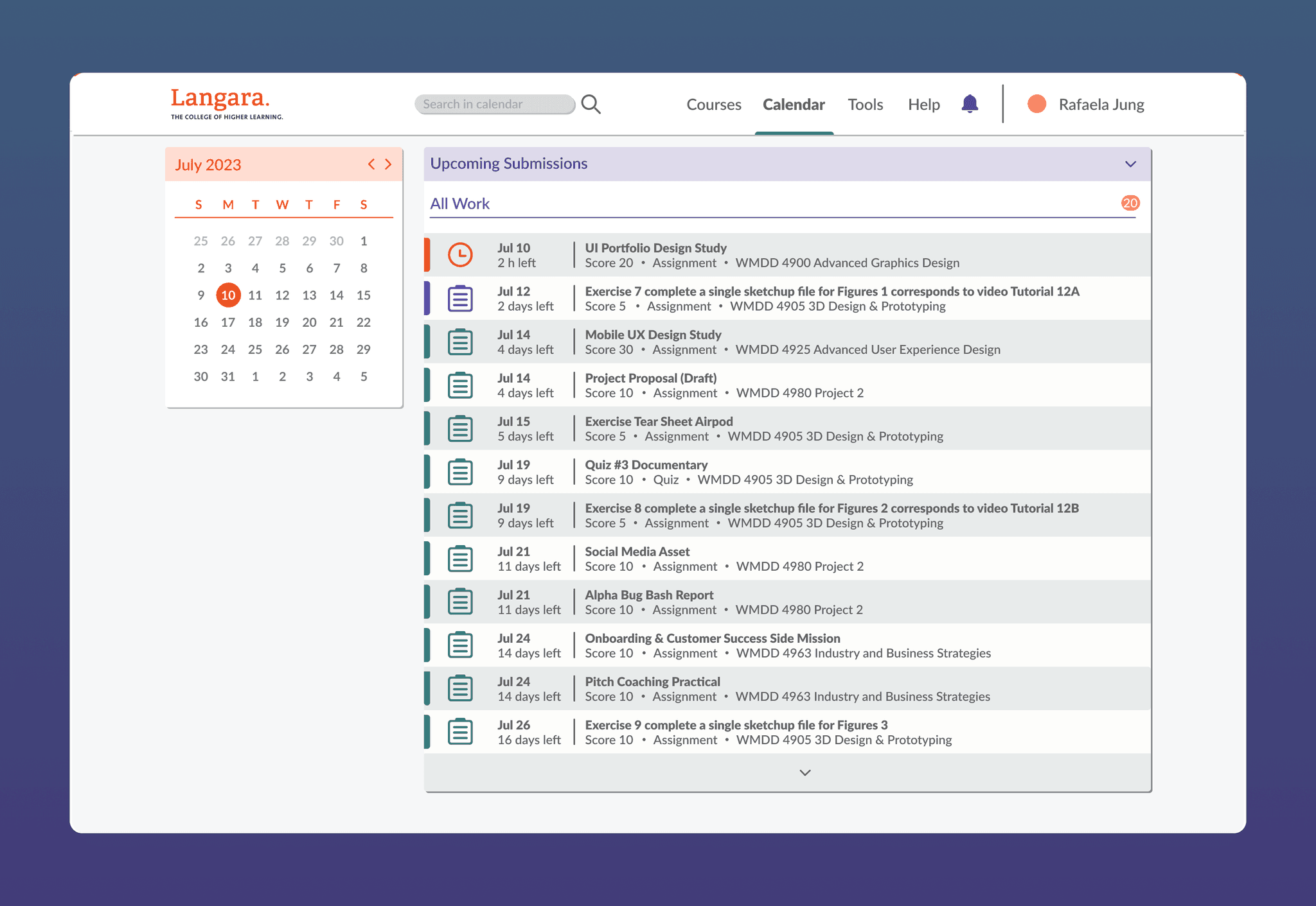
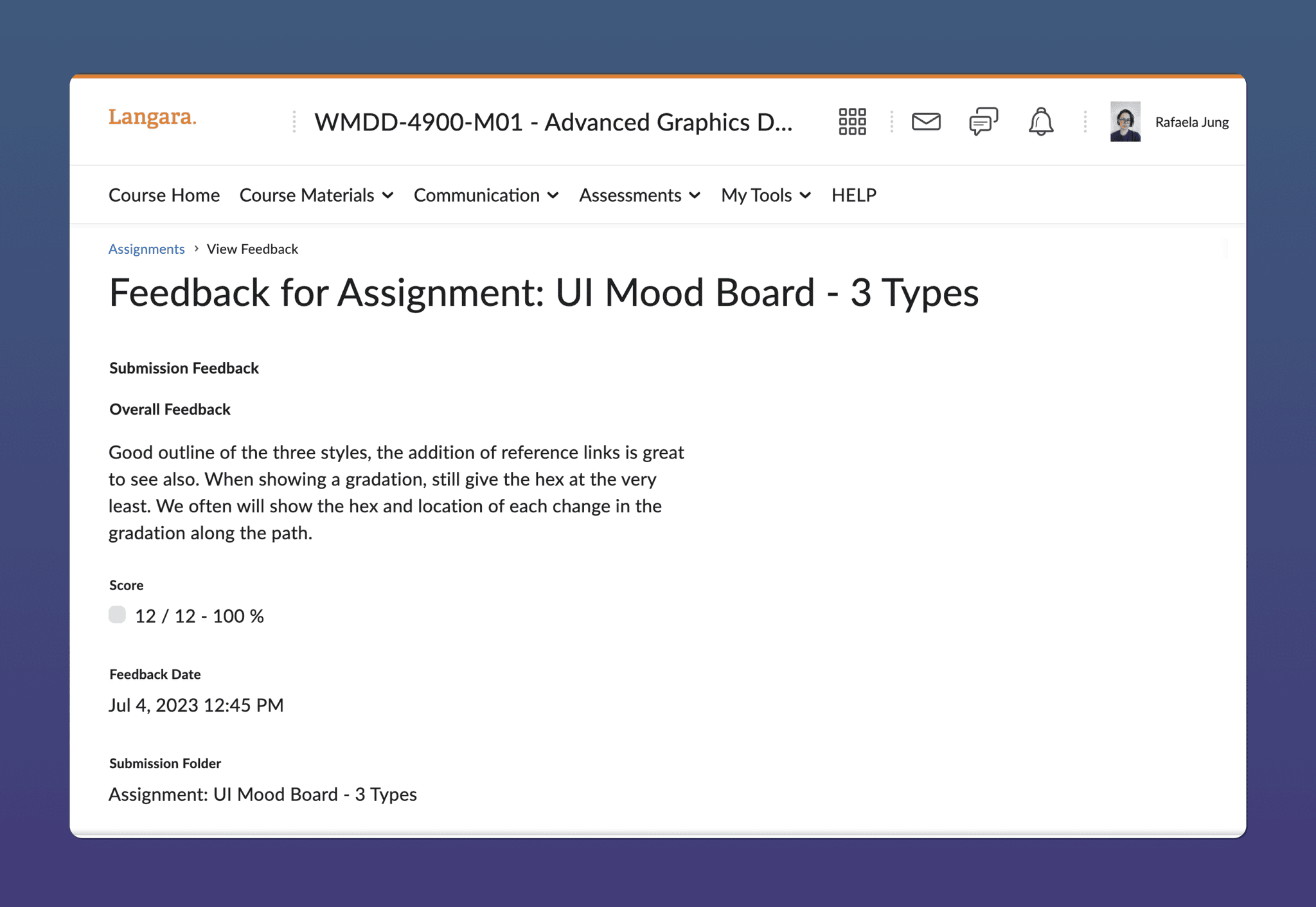
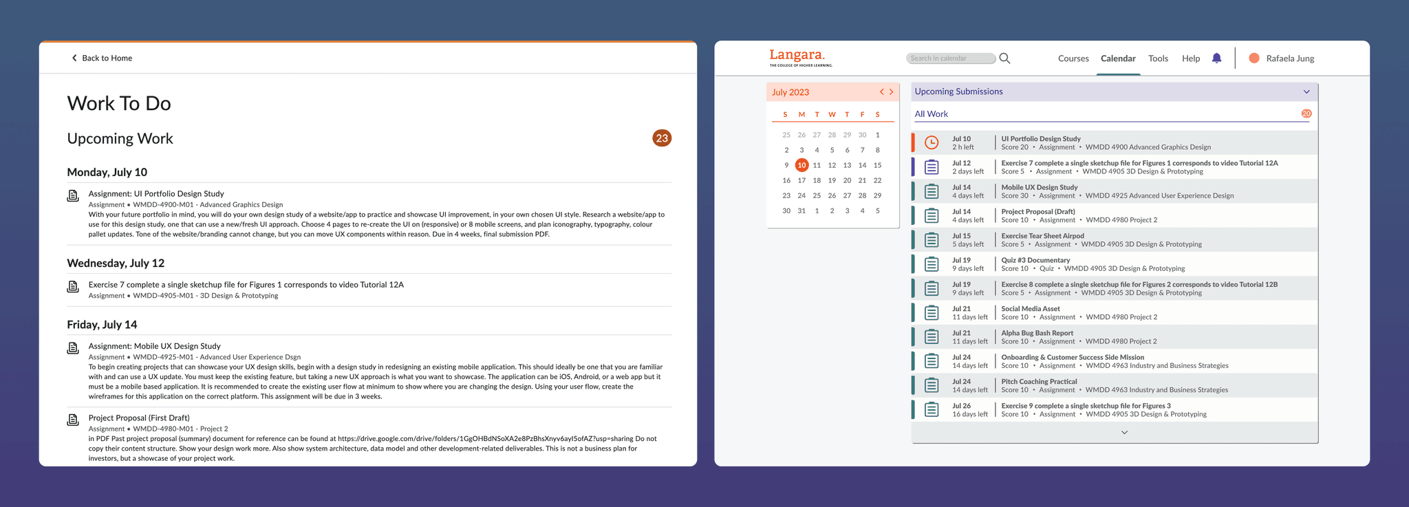
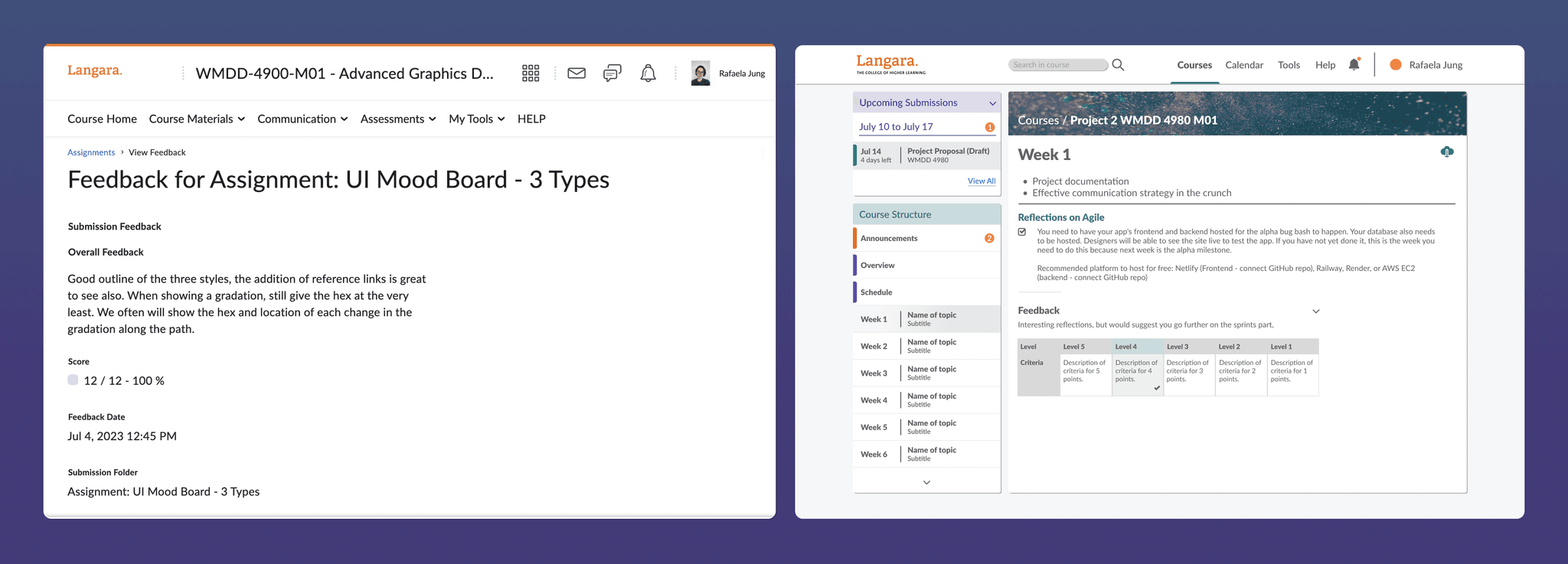
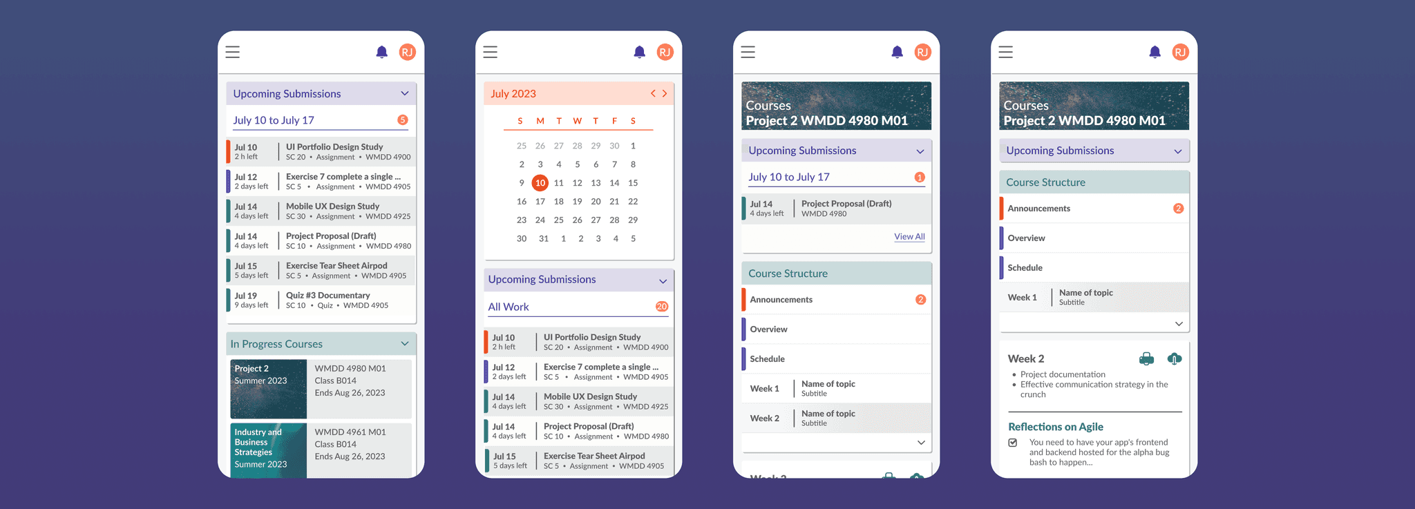
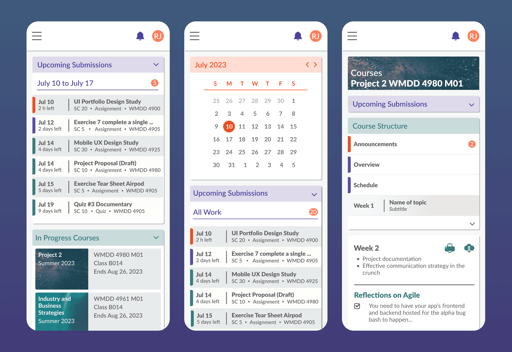
This is a redesign proposal for the D2L, Brightspace platform. In 2 days I created a version for some of the pages that enhances the consistency of the platform within both desktop and mobile versions, as well as improves the navigability considering the most used features from a student perspective view.
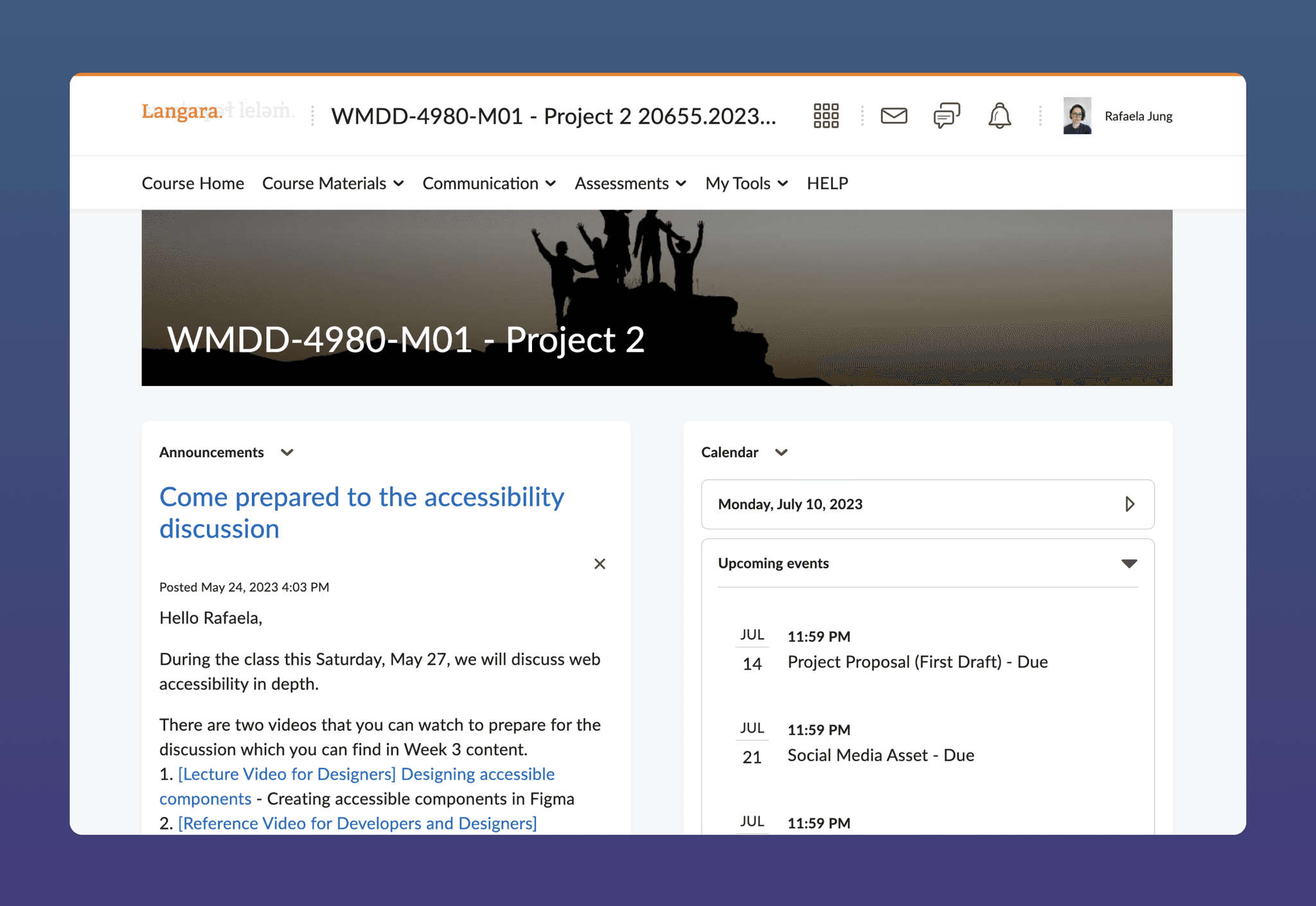
The current platform uses an approach that is simple and neutral, which is justified by the fact that multiple institutions use it and it has to adapt to different types of visual identity. However, there is room for improvement, since in the 2 years I have been using the platform, different people complained about being unable to find the material related to specific courses. The institution I was studying at even had to create a course on how to use it. My redesigns seeks to improve the way students use the platform.
For the students, enhancing those components helps them easier and quicker access to the features and the information they need to use. For the instructors, not having to show or create several templates will also make the process of using the platform more frictionless.
